- Your summary only works if it sits inside the first scan path: Contact, headline, summary, proof.
- Use one of three safe placements: Standard one-column, headline-first, or full-width above a two-column body.
- If you cannot make it specific in 3 to 5 lines, remove it and let your first bullets do the talking.
The Simple Truth: A Summary Gets Read Only If It Appears In The First Scan
I have reviewed a lot of resumes where the “summary” was technically present, but functionally invisible. Not because the words were bad, but because the placement made it easy to skip. If you are searching where to put resume summary, you are already asking the right question. Placement is not decoration. It is a reading decision you are forcing on a tired human.
One recruiter I worked with called it the “first rectangle” rule. They do not read in order. They scan in rectangles. The first rectangle is the top third of page one. If your summary is not inside that rectangle, it is competing with everything else for attention.
💡 Pro Tip: Think of the summary as a bridge. It should sit between identity (who you are) and proof (why you are credible).
The Recruiter Scan Map: What Eyes Usually Hit First
Most resumes are not “read”. They are triaged. The first pass is a yes or no filter: Role match, seniority match, proof density. Your summary should support that filter, not demand extra work.
| Zone | What The Reader Wants In That Zone | What Breaks Trust |
|---|---|---|
| Top left | Name, role identity, location basics | Missing role signal, unclear target |
| Top third | Fast match: Title, specialty, proof hint | Generic claims, long paragraphs |
| Middle | Proof: bullets, metrics, scope | Walls of text, vague responsibilities |
| Bottom | Details: tools, education, extras | Key story hidden too late |
So the real rule is not “top of the resume”. The real rule is: Put the summary where it supports the first match decision.
⚠️ Warning: If your summary starts below the fold on a laptop screen, it is already losing.
Placement Rules That Work In Real Life
Here are the rules I use when helping candidates fix summary placement. They are simple, but they prevent 90% of the “why is nobody reading this” problems.
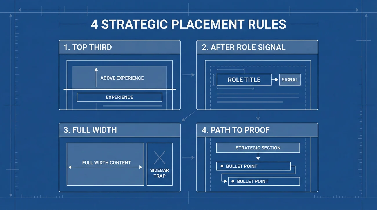
Rule 1: Keep It In The Top Third, Above Experience
If the summary sits under experience, it becomes an afterthought. The reader has already formed a judgment from your bullets. A summary placed too low also feels like you are trying to “explain yourself” after the fact.
Rule 2: Place It After Your Role Signal, Not Before
Role signal can be a headline, a target title line, or a tight descriptor under your name. The order matters:
- Contact block first: So the resume is identifiable.
- Role signal next: So the reader knows what to evaluate you as.
- Summary after that: So the summary feels anchored and specific.
Rule 3: Use Full Width Summary Before Any Columns
If you use a two-column layout, do not trap your summary inside a narrow sidebar. In real reviews, narrow columns get skimmed or skipped. Even worse, some ATS parsers scramble column order and your summary can land in a weird place.
Rule 4: Let The Summary Point Down To Proof
A summary should set up what the reader will see next. If your summary says “data-driven leader”, your next bullets must immediately show scale, metrics, or scope. The placement should make that connection effortless.
Three Safe Layout Patterns You Can Copy
Instead of arguing about “top or not”, pick a pattern that matches your resume structure. These are the placements I trust because they survive both human scanning and messy systems.
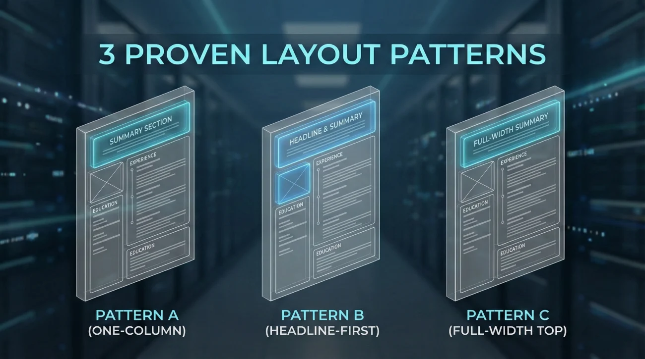
Pattern A: Standard One-Column
City, ST | Email | Phone | LinkedIn
Professional Summary (3 to 5 lines)
Key Skills (optional short row)
Experience
Education
This pattern works for most candidates because it keeps the summary inside the first rectangle and directly above the proof.
Pattern B: Headline First, Summary Second
City, ST | Email | Phone | LinkedIn
Headline: Target Role + Specialty + Proof Hint
Professional Summary (2 to 4 lines)
Experience
Use this when you need extra clarity on what you are. Career changers and specialists often benefit from a headline that frames the summary.
Pattern C: Two-Column Body, Full-Width Top
Full-width headline (optional)
Full-width Professional Summary
Then start two columns: Skills left, Experience right
This avoids the common mistake where the summary gets trapped in the left column like a footnote.
“I saw your summary, but I read it after your experience. By then, I already decided what you were.”
That is the whole game. Placement decides when your story enters their head.
When You Should Move The Summary Down, Or Delete It
This is where most generic advice fails. Summary placement is not universal. Sometimes the best placement is “nowhere” because your bullets do the job better.
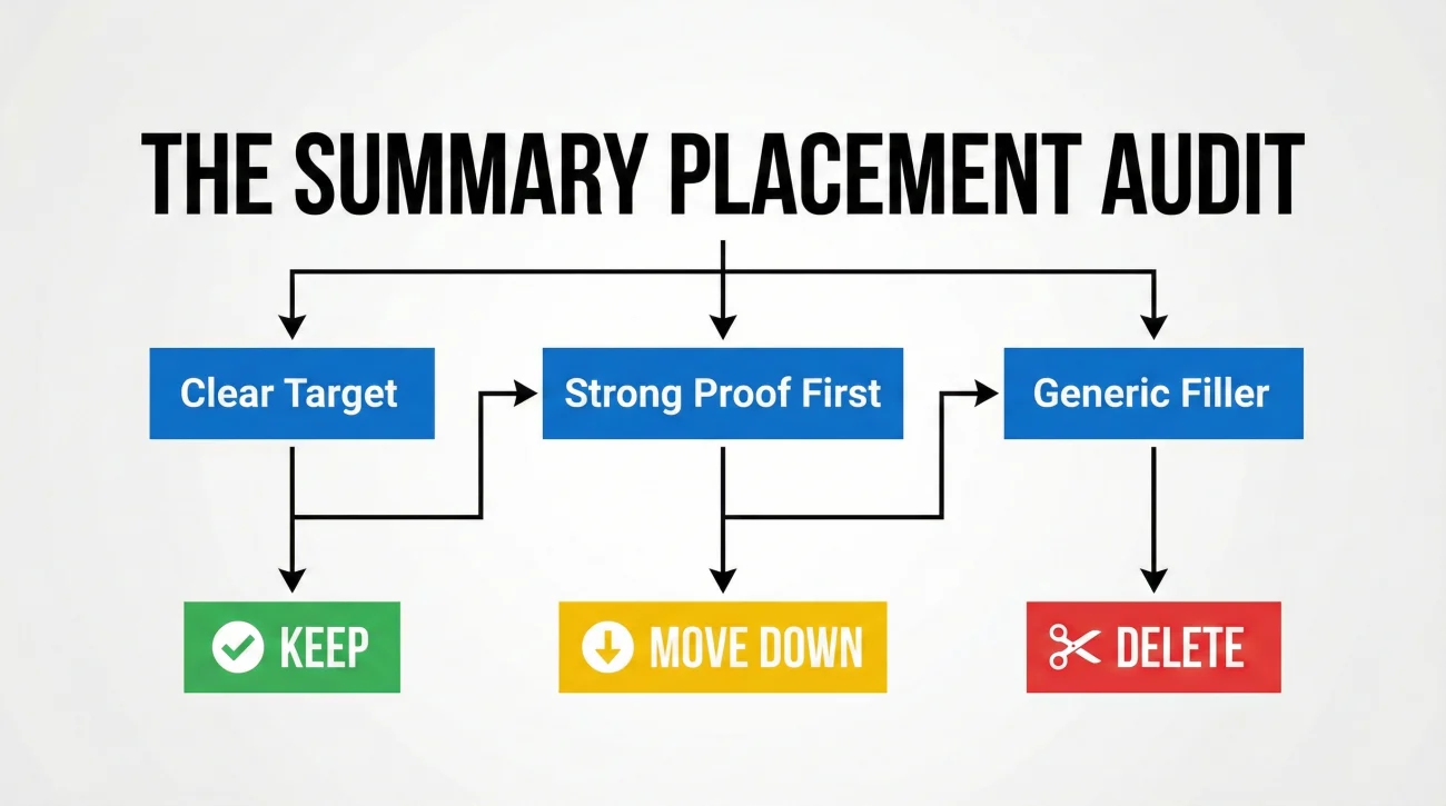
Move It Down When Your First Proof Is Stronger Than Your Summary
If your first two bullets under your most recent role are sharp, quantified, and obviously relevant, a summary can feel like repetition. In that case, put a short headline and go straight into experience.
Delete It When You Cannot Make It Specific
I tell candidates this gently: A vague summary is worse than no summary. Words like “hardworking” and “team player” are not summaries. They are filler. If you cannot name your target role, your scope, and one proof anchor, remove the section.
❌ Note: If your summary is longer than your newest job bullets, it is stealing oxygen from the proof.
Special Cases That Change The Rule
- 🧩 Executive resumes: A slightly longer summary can work, but it still must live in the top third and point to scope.
- 🎓 Students and new grads: Skip the summary unless you have a clear target and relevant projects. Use a short “Focus” line instead.
- 🛠️ Technical one-page resumes: Often better with headline plus skills plus experience. A summary can be redundant.
Mistakes That Make A Summary Easy To Ignore
I keep seeing the same placement errors. Fixing them often improves response rates without changing a single word in experience.
Mistake 1: Summary After Experience
The summary becomes an explanation instead of an opener. If it contains your best positioning, it is arriving too late.
Mistake 2: Summary Hidden In A Sidebar
A narrow column invites skipping. It also increases parsing risk. If you like a two-column look, keep the summary full width before columns start.
Mistake 3: Summary Competing With A Huge Skills Block
When skills takes half the page above experience, the summary loses its job. Either shorten skills to a tight row or move skills below the summary.
Mistake 4: A Paragraph That Feels Like A Cover Letter
If it looks like a dense paragraph, it reads like effort. Keep it 3 to 5 lines, with concrete nouns and proof hints.
Six Resume Header Examples With Correct Summary Placement
These are not full resumes. They are the top area only, because that is where placement matters most. Use them as layout references, then tailor the content to your proof.
Example 1: Standard Placement For A Mid-Level Role
Chicago, IL | [email protected] | 555-0101 | LinkedIn
Professional Summary: Project manager in B2B SaaS, known for reducing delivery risk and tightening cross-team execution. Led 12 launches across product and marketing with clear stakeholder alignment. Strong at turning vague goals into measurable plans.
Example 2: Headline First For A Career Pivot
Austin, TX | [email protected] | 555-0102 | LinkedIn
Headline: Customer Support Lead Pivoting To Customer Success | Retention + Process Improvement
Professional Summary: 6 years in high-volume support, stepping into CS with proven onboarding wins. Built playbooks that cut time-to-resolution by 18% and improved CSAT in a churn-heavy segment. Comfortable owning renewals conversations with clear data.
Example 3: Full Width Before Two Columns
Seattle, WA | [email protected] | 555-0103 | LinkedIn
Professional Summary: Backend engineer focused on reliability and cost control. Improved API latency and reduced infra spend through better observability and pragmatic refactors. Known for clean handoffs, useful docs, and steady delivery.
Example 4: Short Summary With Proof Anchor
New York, NY | [email protected] | 555-0104 | LinkedIn
Professional Summary: Growth marketer with paid social and landing page optimization focus. Managed 500K monthly spend and improved qualified lead rate through structured testing and tighter targeting.
Example 5: Senior Scope Without Being Long
San Jose, CA | [email protected] | 555-0105 | LinkedIn
Professional Summary: Operations leader building scalable systems for teams from 30 to 250. Led SOP redesigns, vendor consolidation, and KPI cadences that improved cycle times and reduced operational surprises. Strong partner to finance and people teams.
Example 6: Minimalist Header, Summary Still In The Scan Path
Denver, CO | [email protected] | 555-0106 | LinkedIn
Professional Summary: Analyst who turns messy datasets into decision-ready reporting. Experienced in stakeholder intake, metric definitions, and building dashboards that people actually use.
A Quick Placement Checklist Before You Export PDF

Before you obsess over wording, run this quick placement check. It prevents the summary from becoming invisible.
- ✅ Summary sits above Experience on page one.
- ✅ Summary is inside the top third of the page.
- ✅ Summary follows a role signal: Headline or target title line.
- ✅ Summary is full width, not squeezed into a sidebar.
- ✅ Summary is 3 to 5 lines, not a paragraph.
- ✅ First bullets in experience immediately back up the summary’s claims.
Final: Placement Is A Reading Shortcut, Not A Design Choice
I have seen candidates rewrite their summary ten times when the real issue was that no one was ever seeing it at the right moment. Your summary is an opener, not a footer. Put it where a human naturally looks first, and make it point directly to proof.
If you came here searching where to put resume summary, keep this mental picture: Contact, role signal, summary, proof. When that chain is clean, your resume feels easier to read, and “easy” is often what gets you the next step.
❓ FAQ
🎯 Should the resume summary go above or below the skills section?
Most of the time: Put the summary above skills, then keep skills as a tight row or compact list. If skills is huge and pushes experience down, the summary loses its job. The only time I flip it is when the role is tool-heavy and the skills block is short enough to stay in the top third.
🧭 Where do I put a summary if I use a two-column resume?
Place the summary full width before the columns begin. Treat it like part of the header. After that, you can split into columns for skills and details. This keeps the summary inside the scan path and avoids parsing issues.
🧩 Do I need both a headline and a summary?
Not always. A headline can clarify your target role in one line. The summary then earns its space only if it adds proof anchors and scope. If the two lines repeat the same claim, keep the headline and shorten or remove the summary.
⏱️ How long should the summary be if it sits near the top?
Usually 3 to 5 lines, or 2 to 4 lines if you already have a headline. If you need more space to explain, that is often a signal that the content belongs in experience bullets or projects, not in the summary.
🧠 What is the biggest placement mistake you see?
Putting the summary after experience, or burying it in a sidebar. Both mistakes turn the summary into something optional. If it is optional, it will be skipped.
📌 If I remove the summary, what should go at the top instead?
Use a tight headline that states your target role and specialty, then go straight into experience. If you want one more layer, add a compact skills row. The top should still feel like identity first, then proof.
⚠️ Disclaimer: ResumeSolving provides resume, cover letter, job search communication, and career transition guidance for informational purposes only. Hiring practices vary by employer, role, location, industry, and individual circumstances. We do not guarantee interviews, job offers, ATS results, or other outcomes. Verify employer requirements directly and follow applicable laws and workplace policies. For sensitive situations, use only information you are comfortable disclosing and keep all statements accurate.