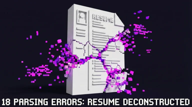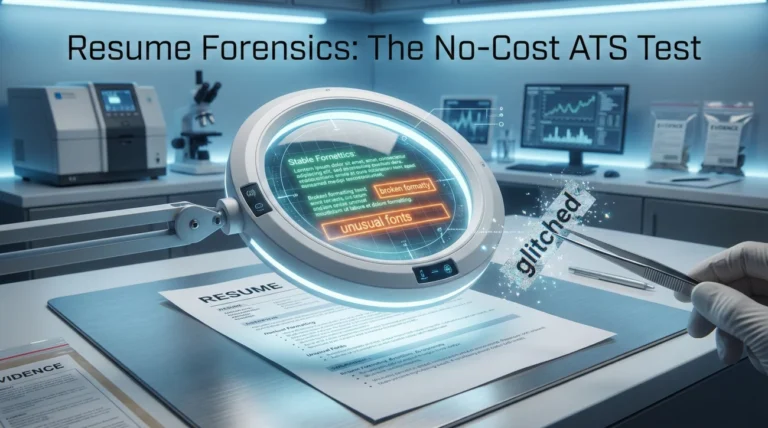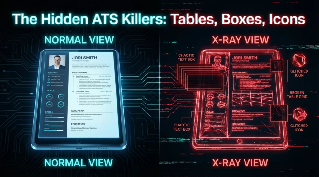
- If you use tables, text boxes, or icons, your resume may look fine to you but arrive as scrambled text to an ATS.
- The fastest check is a copy-paste test: If your dates and titles jump around, your layout is doing the damage.
- You do not need a boring resume to be ATS-safe: You need clean structure, real text, and predictable reading order.
Why This Happens More Than People Admit
I have watched candidates lose time for a reason that feels unfair: Their resume reads beautifully on their screen, but the ATS record looks like someone dropped the text on the floor and kicked it around.
And the frustrating part: Most advice online collapses everything into one sentence. “Avoid tables and text boxes.” True, but incomplete. The useful question is: What breaks, what disappears, and what a recruiter actually sees when resume tables and text boxes ATS issues show up.
One quick story. A candidate named Ruby applied for a hybrid operations role. Her resume had a neat two-column design with icons for contact info and a table for skills. In the ATS profile, her phone number was missing, her job dates appeared under the wrong employer, and half her bullets were merged into one line. She assumed she was being ignored. In reality, the hiring team could not quickly verify her timeline.
Key Point: Most ATS problems are not “rejection rules.” They are “reader problems.” If the record looks messy, humans hesitate, especially when they have 80 other applicants.
What Actually Breaks: Tables, Text Boxes, Icons
ATS parsing is basically a translation step. Your document is turned into plain text fields. Anything that is not real text in a predictable order risks becoming noise.
Tables: Great for alignment, bad for reading order
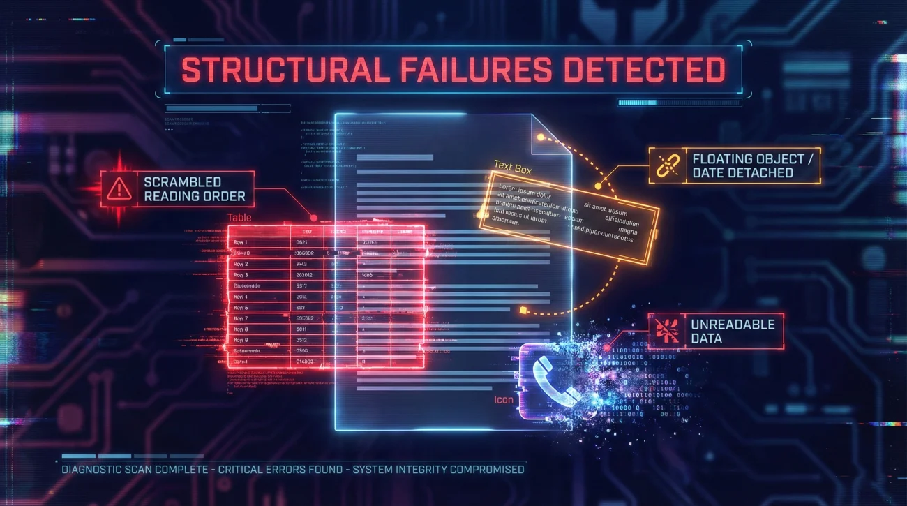
Tables often cause two ugly outcomes: The ATS reads cells left-to-right in a way you did not intend, or it drops entire cells as “unreadable blocks.” This is why tables in resume ATS advice is usually “avoid them,” but the real issue is that tables are not a single continuous sentence to a parser.
⚠️ Warning: Skills tables are especially risky because they often contain short fragments. When they scramble, your skills look like random words instead of a clear list.
Text boxes: The #1 culprit behind missing dates and floating lines
A text box is not a paragraph in the normal document flow. It is a positioned object. That means your timeline can be visually perfect, but the ATS may read it last, read it first, or skip it.
If you have ever seen your job title separated from your employer name after copy-paste, that is a classic text box resume ATS symptom.
Icons: When you replace words with pictures, you remove the words
Icons are not text. Even if your icon looks crisp, the ATS might store it as nothing. If your email is written as an icon plus a handle, the handle might survive, but the “email” context disappears. If your phone number sits next to a phone icon inside a text box, both can vanish.
❌ Note: The highest-impact icon mistake is contact info. Recruiters will not hunt for it inside a broken ATS record. They will move on.
How a Broken Resume Shows Up Inside an ATS
Most candidates never see the ATS view. So they assume “ATS rejected me.” In practice, the resume often becomes a messy profile that is hard to trust quickly.
| What you intended | What the ATS often shows | Why it matters to a recruiter |
|---|---|---|
| Two clean columns: Summary left, experience right | Text stitched together in the wrong order | Your story feels inconsistent or incomplete |
| Skills table with neat categories | Random skills scattered, some missing | Harder to match you to the role quickly |
| Dates aligned perfectly in a right column | Dates floating away from job titles | Timeline becomes questionable at a glance |
| Icons for email, phone, location | Missing contact fields or weird symbols | They cannot contact you fast, so they do not try |
One of my colleagues in talent acquisition once said something that stuck with me: The ATS view is not a “secret robot filter,” it is a messy inbox. If your content arrives scrambled, you feel like a risky bet even when you are not.
“I can handle a simple resume that looks plain. What slows me down is when the system turns it into soup and I have to guess what goes where.”
The Do-Not List: If You Want Fewer Parsing Surprises
I am not anti-design. I am anti-design that hides your evidence. Here is the practical “avoid it unless you have a very specific reason” list.
- Tables for skills, tools, or project summaries.
- Text boxes for job titles, dates, or employer names.
- Icons that replace words in contact info.
- Infographic skill bars or rating dots.
- Two-column layouts built with shapes or floating elements.
- Headers and footers that contain important text, especially contact details.
💡 Pro Tip: If you absolutely must keep a visual touch, keep it in spacing, bolding, and clean section breaks, not in structural elements like tables and boxes.
The Fast Test: Know If Your Layout Is the Problem in 60 Seconds
When someone tells me “I think my resume is ATS-safe,” I do not argue. I test it quickly.
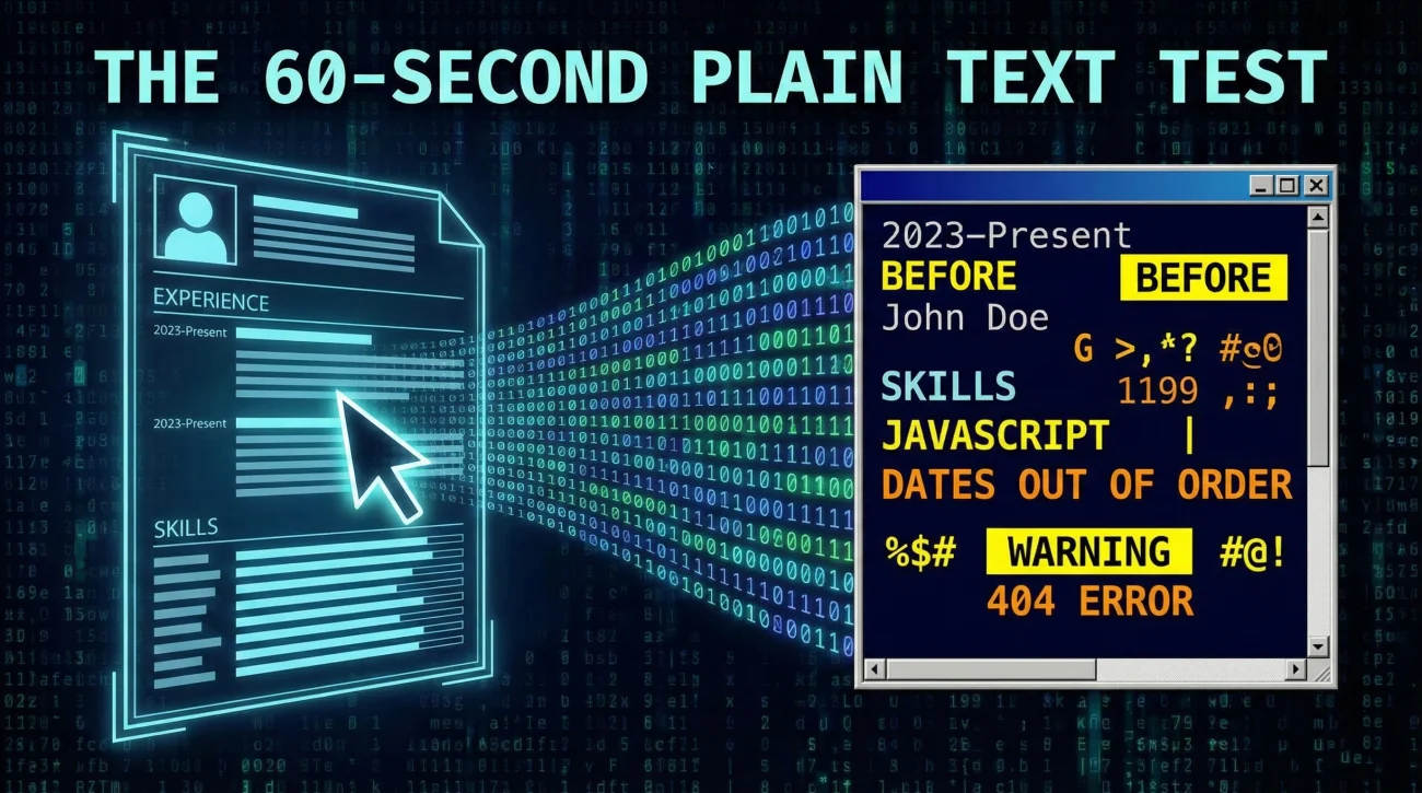
Test 1: Copy-paste into plain text
Open your resume, select all, paste into a plain text editor. You are not checking grammar. You are checking order.
- If your jobs appear out of order, your layout is not in a stable flow.
- If dates detach from titles, you probably used alignment tricks like tables or text boxes.
- If contact info loses email or phone, your icons or header are eating it.
Test 2: Highlight drag test
Click at the top of the document and drag down while highlighting. If your highlight jumps across columns or skips blocks, your content is likely “positioned,” not linear.
⚠️ Warning: Passing these tests does not guarantee perfection in every ATS. Failing them is the bigger signal. If plain text looks wrong, your ATS record will probably look wrong too.
Fixes That Keep Your Resume Clean Without Making It Ugly
The goal is not to punish your resume into being bland. The goal is to keep it readable everywhere: ATS, recruiter preview, mobile, and PDF viewer.
Replace tables with predictable structures
Instead of a skills table, use a simple list with categories written as text. It still looks organized, but it stays linear.
Analytics: Cohort analysis, A/B testing, Forecasting
Collaboration: Jira, Confluence, Stakeholder updates
Replace text boxes with spacing, not objects
If you used text boxes to align dates on the right, switch to a single line where the date is part of the text. You can still format it cleanly with consistent separators.
– Reduced shipping exceptions by 18% by rebuilding routing rules
– Partnered with CS and warehouse leads to tighten handoffs
Replace icons with words, then let whitespace do the design
Instead of a row of icons, write the fields. If you want a polished look, keep them on one line separated by vertical bars.
Key Point: If the information is important, it must exist as text. Styling is optional. Text is not.
If You Used Canva, Here’s the “Save It Tonight” Approach
I see the same pattern over and over: Someone builds a gorgeous Canva resume, exports to PDF, applies to 40 roles, then panics after reading that canva resume ATS might fail. The best response is not shame. It is triage.
Step 1: Identify what you used that is risky
- Did you build the layout with multiple text boxes.
- Did you use icons for contact fields.
- Did you put skills inside a grid or table-like block.
Step 2: Move your content into a clean document flow
The safest path is to paste the text into a simple one-column template in a word processor and rebuild spacing using real paragraphs, not objects. You can keep the same wording and hierarchy, just not the same visual structure.
💡 Tip: If you are applying to design roles, keep the Canva version as a portfolio-friendly PDF, but submit a clean ATS-safe resume for systems that require parsing.
Another quick story: A candidate named Omar was applying for a business analyst role. He kept his Canva design because it “looked professional.” We created a second version that was text-first. Same content, different structure. The response rate changed, not because of magic, but because his timeline finally looked coherent inside the system.
When These Elements Might Be Fine: The Honest Nuance
Some ATS platforms parse modern PDFs better than others. Some recruiters barely rely on auto-parsed fields and open the PDF directly. That is why you will find people saying “It never mattered for me.” They might be telling the truth.
The issue is not whether tables or icons can work sometimes. The issue is whether you want to gamble your first impression on “sometimes.” If you are applying at scale, the safest option is a layout that fails gracefully. A plain structure still reads like a resume even if parsing is imperfect. A table-based structure can collapse into nonsense.
⚠️ Warning: If your resume relies on icons to communicate meaning, you are betting against the parsing step and against accessibility at the same time.
Final
When candidates ask me what “ATS-friendly” really means, I keep it simple: Predictable reading order, real text, and boring reliability in the places that matter.
Tables, text boxes, and icons are not evil. They are just fragile. If your resume has to survive different systems, uploads, previews, and mobile screens, fragility is a tax you do not need to pay.
If you want one clean rule to remember, it is this: If you would be upset if a detail went missing, do not place it inside a table, a floating box, or an icon-based line. Protect the essentials, and your formatting becomes a tool instead of a risk.
That is the real reason resume tables and text boxes ATS issues keep showing up: People optimize for the PDF view, but hiring happens across systems you do not control.
❓ FAQ
🧩 Can an ATS read tables at all?
Sometimes. Some systems extract table text, but the order can scramble, and cells can be dropped. If the table contains critical details like dates, titles, or skills, the risk is rarely worth it.
📦 Are text boxes always a problem?
They are unpredictable because they are positioned objects, not part of normal text flow. If you used them for decorative callouts, the damage is smaller. If you used them for job titles or dates, the damage is often serious.
☎️ Do icons really hurt, or is that exaggerated?
Icons hurt most when they replace words in contact info. If an icon disappears, the meaning disappears. Writing “Email:” and “Phone:” is boring, but it is searchable and stable.
🧪 What is the best quick test for ATS readability?
Copy-paste into a plain text editor and check the order of job titles, employers, and dates. If the plain text looks wrong, the ATS record will likely look wrong too.
🖥️ If I am applying for design roles, do I still need an ATS-safe version?
Often yes. Keep a designed PDF for humans and portfolios, but submit a clean text-first resume for systems that parse. You can include design taste elsewhere, but your work history should stay readable in any system.
⚠️ Disclaimer: ResumeSolving provides resume, cover letter, and job search communication guidance for informational purposes only. It is not legal, medical, financial, or professional counseling advice. Hiring decisions vary by company, role, location, and individual circumstances, so we do not guarantee interviews, offers, or outcomes. Always use your own judgment, verify requirements directly with the employer, and follow local laws and workplace policies. When a situation is sensitive, we prioritize privacy-safe, recruiter-appropriate wording, and you never need to share personal details you are not comfortable disclosing.