- An ATS-friendly resume format is less about “gaming software” and more about preventing parsing errors that hide your strongest proof.
- The safest default is a single-column layout with plain text, standard headings, and zero tables or text boxes.
- Before you submit, run quick reality checks: copy into plain text, scan for missing dates, and confirm the order still reads like a human story.
Why a Clean Resume Layout Still Wins in 2026
I’ve watched the same weird pattern for years: A candidate has solid experience, strong metrics, good references, and still gets “no response” across multiple applications. When we finally open the submitted file inside a hiring system preview, half the story is missing. Dates float into the wrong line. Company names get glued to job titles. Skills become a single unreadable paragraph. The content was fine. The structure quietly sabotaged it.
This is why I’m strict about one thing: your resume should be readable in three places at the same time: By a human, by a parser, and by whatever “preview” screen the recruiter sees first. That’s what an ATS friendly resume format actually means in practice.
One candidate, Zayla, sent me a beautiful two-column resume built in a design tool. On her screen it was flawless. In the ATS preview, her job titles were split across lines and her most recent employer looked like a bullet point under Education. She wasn’t rejected for lack of ability. She was rejected because her resume looked confusing at the exact moment the recruiter tried to skim it.
💡 Pro Tip: “ATS-friendly” is not a style trend. It is an error-prevention strategy: You are removing anything that can scramble your proof.
The Core Rules of an ATS-Friendly Resume Format
If you only remember one idea, remember this: Most formatting problems happen when your resume stops being plain, selectable text in a predictable order. The safest structure is boring on purpose.
Rule 1: Use a single-column reading order
A single column is the most consistent way to keep your dates, titles, and employers aligned. Multi-column designs can work sometimes, but when they fail, they fail silently. The system might still accept your upload while misreading your story.
⚠️ Warning: A resume that “looks fine” as a PDF can still parse wrong. Visual layout is not the same thing as text extraction.
Rule 2: Avoid tables, text boxes, and header/footer contact blocks
Tables and text boxes are common because they make alignment easy. They are also common because they break parsing. If your phone number sits in a header, some systems won’t pull it into the contact field. If your dates sit in a table, your timeline may fragment.
Rule 3: Keep fonts and symbols boring
Use standard fonts and standard bullet characters. Fancy symbols can turn into empty squares or random characters after upload. That one small glitch is enough to make your resume look messy in a skim view.
Rule 4: Use standard section headings
Recruiters skim on autopilot. Parsers map data based on labels. Keep headings predictable: Summary, Experience, Education, Skills, Certifications, Projects (if needed). Creative headings are not worth the risk.
Rule 5: Build spacing with simple line breaks, not layout tricks
Some candidates force spacing with extra tabs, multiple spaces, or invisible characters. It can render differently in different viewers. Keep spacing simple and consistent.
| Format Choice | Why It’s Risky | ATS-Safe Alternative |
|---|---|---|
| Two columns for skills and contact | Reading order can scramble; sections can merge | Single column with a compact Skills block |
| Tables for dates and locations | Dates may detach from roles | Dates on the same line in plain text |
| Text boxes for Summary | Text may not be extracted at all | Normal paragraphs under a Summary heading |
| Icons for phone, email, LinkedIn | Icons can become random characters | Label text like “Email:” and “LinkedIn:” |
What Recruiters Actually Experience When Your Format Breaks
A lot of resume advice talks about ATS like it’s a single robot gatekeeper. Reality is more annoying: There are multiple layers where formatting can fail, and humans often see an imperfect “extracted” version first.
My friend Joshua (internal recruiter) once summed it up in a way I wish every candidate heard before they open Canva.
“If your resume makes me work to understand your timeline, I don’t. I’m not punishing you. I’m just moving fast. Clean resumes feel like competence.”
That’s the real cost. A broken format doesn’t just reduce “ATS score.” It makes your candidacy feel confusing at the exact moment speed matters most.
Another candidate, Patrick, had a strong technical background and a clean project list, but he placed his entire Experience section inside a styled text box so the design would look balanced. In plain text extraction, his Experience vanished. The recruiter didn’t reject him because he lacked experience. The system preview made it look like he had none.
A Practical ATS Friendly Resume Layout You Can Copy
Let’s build an ATS friendly resume format that stays clean without looking empty. This is the layout I default to when I’m helping candidates who want fewer variables and more predictability.
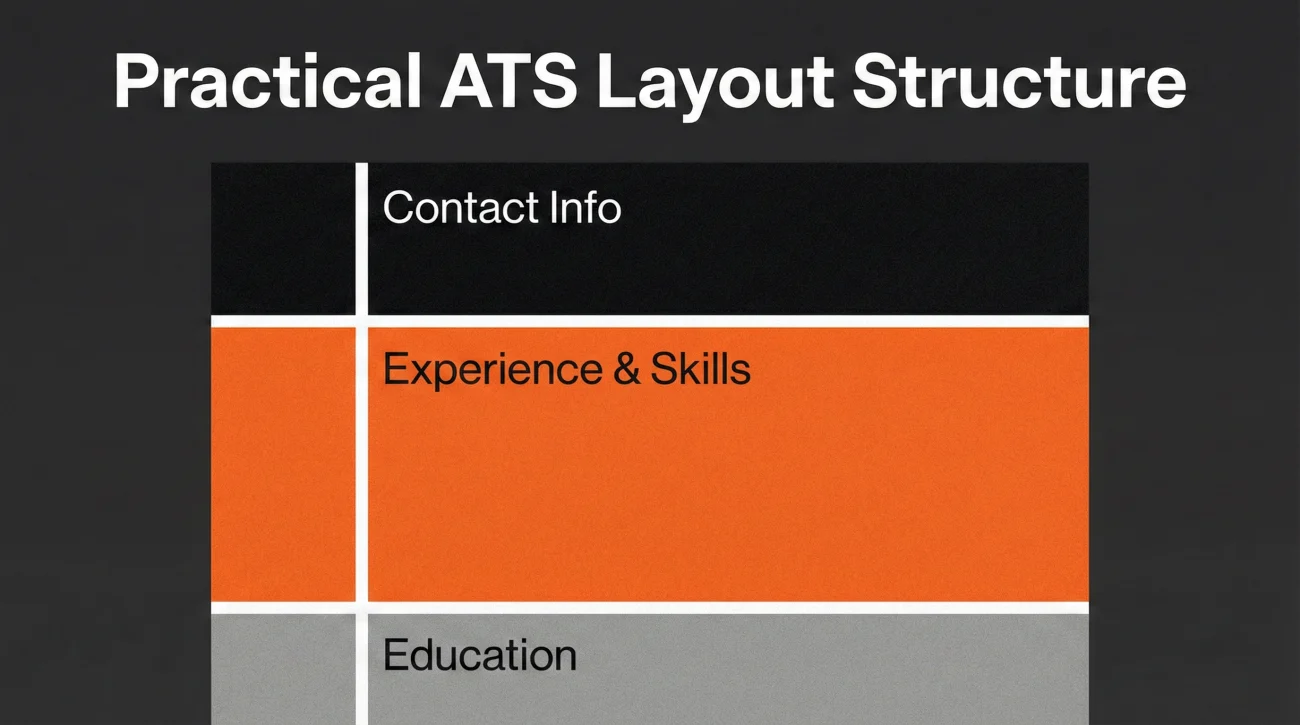
Contact block (in the body, not the header)
Austin, TX | 512-555-0148 | [email protected]
LinkedIn: linkedin.com/in/mayachen | Portfolio: mayachen.com
Summary (2 to 3 lines, no graphics)
Operations analyst with 5+ years in SaaS and logistics. Known for building dashboards that cut reporting time by 40% and improving process compliance across cross-functional teams.
Experience (the ATS-safe bullet pattern)
Senior Operations Analyst | Northbridge Software | 2022 to 2025
– Reduced monthly reporting cycle from 8 days to 3 days by rebuilding KPI dashboards and data pipelines
– Led cross-team rollout of a new ticket triage process, improving first-response time by 28%
Operations Analyst | Harborline Logistics | 2019 to 2022
– Improved inventory reconciliation accuracy by 15% by redesigning exception workflows and training ops leads
💡 Pro Tip: If you want to align dates on the right, don’t. Keep everything left-aligned. Clean beats clever.
Skills (keywords without keyword spam)
This is where people accidentally ruin formatting by adding columns, bars, or grouped boxes. A simple list is enough. If you want it more scannable, use categories in plain text.
Analytics: SQL, Excel, Tableau, Looker
Operations: Process mapping, SOP design, KPI reporting
Collaboration: Stakeholder updates, cross-team delivery, documentation
Think of this as your baseline ATS resume format. You can add personality through strong outcomes and clear scope, not through layout tricks.
Six ATS-Compatible Format Examples for Different Situations
People ask for “the best format” like there’s one universal answer. In reality, the best format is the one that protects your story from parsing errors while matching your career context. Below are six patterns I’ve used with candidates, each still staying inside an ATS compatible resume format.
Example 1: Early-career with projects (keeps proof above fluff)
Project highlight (1 to 2 lines)
Experience (including internships)
Projects (2 to 3 projects, each with measurable result)
Education
Skills
Best when your internships are real but short. Projects become “proof,” not filler.
Example 2: Career changer (translates, then proves)
Core Skills (category list, plain text)
Relevant Projects (bridge evidence)
Experience (focus bullets on transferable scope)
Education and Certifications
I used this for Karen, who moved from customer support into HR ops. Her resume stopped looking like “a different profession” and started reading like “the same problem, new lane.”
Example 3: Mid-career specialist (keeps Experience dominant)
Experience (largest section)
Skills (tight, role-specific)
Education
Certifications (only if relevant)
This is the simplest structure and the least likely to break.
Example 4: Leadership (adds a “selected wins” block safely)
Selected Wins (3 bullets, outcomes only)
Experience (leadership scope, budget, org size)
Education
Skills (executive-level, not tools soup)
Leadership resumes often fail because they over-design the top. Keep it plain, let the wins carry the weight.
Example 5: Technical candidate with certifications (keeps signals readable)
Skills (tools grouped by category)
Certifications (short list)
Experience
Projects (optional)
Education
Certifications are signals. They should not be buried inside sidebars.
Example 6: Two-page candidate (controls sprawl without columns)
Page 2: Earlier Experience (compressed), Education, Certifications, Projects (if relevant)
When candidates force one page by using columns, tiny fonts, or cramped spacing, the resume becomes harder to skim. Two pages is often cleaner and safer than a “clever” one-page layout.
Do-Not-Do List That Quietly Breaks ATS Parsing
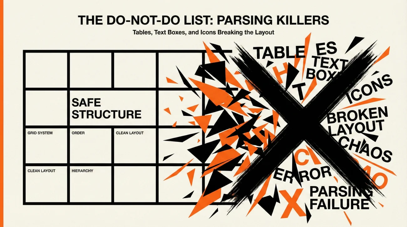
These are the small decisions that cause the most invisible damage. If you avoid them, you’re already ahead of most applicants who are relying on design templates.
- ❌ Put contact info inside header or footer
- ❌ Use tables to align dates and locations
- ❌ Use text boxes for any major section
- ❌ Use icons as labels for email or phone
- ❌ Use multiple columns to “save space”
- ❌ Use fancy bullet symbols that might not extract cleanly
⚠️ Warning: If you built your resume in a design tool, double-check that your exported file still contains plain, selectable text. If you can’t select a line cleanly, parsing may be unreliable.
Two Quick Tests to Confirm Your Resume Is Actually ATS-Friendly
Test 1: The plain-text paste check
Copy everything from your resume and paste it into a plain text editor. Read it top to bottom. If the order feels scrambled, the parser might scramble it too.
Test 2: The “missing data” scan
Search your pasted text for: Your phone number, your most recent company, your most recent job title, and your dates. If any of these disappear or look merged into other lines, simplify formatting until they survive extraction.
This is the part most articles skip. They tell you the rules, but they don’t tell you how to catch failure before you submit.
Final
When candidates ask me if recruiters still care about ATS formatting, I tell them the truth: They care about clarity. ATS issues are just one of the fastest ways clarity gets lost. A clean layout keeps your timeline intact, keeps your proof attached to the right role, and keeps a recruiter from having to “decode” you.
If you want a simple default that survives most systems, stick to one column, plain text, standard headings, and predictable spacing. That’s the quiet power of an ATS friendly resume format in a modern hiring flow: It protects your story when the process is moving too fast to forgive formatting mistakes.
❓ FAQ
🧾 Is a one-column resume always required for ATS?
Not always, but it’s the safest default. Multi-column resumes can work in some systems and fail in others. If you want predictable outcomes across portals, one column reduces risk.
📎 Do tables and text boxes always break ATS parsing?
Not always, but they are the most common cause of missing or scrambled content. If you care about reliability, avoid them entirely.
🖋️ What font should I use for an ATS-friendly resume?
Use a standard, readable font and keep it consistent. The bigger risk is mixing fonts, using unusual symbols, or relying on styling tricks that don’t extract cleanly.
🧠 How do I know if my resume is actually ATS-friendly?
Run a plain-text paste test and scan for missing critical fields like job titles, employers, and dates. If the text reads cleanly in a basic editor, your structure is usually safer.
📄 Can an ATS-friendly resume still look modern?
Yes. “Modern” comes from strong outcomes, clean hierarchy, and sharp wording, not from columns, icons, or design-heavy layouts.
⚠️ Disclaimer: ResumeSolving provides resume, cover letter, and job search communication guidance for informational purposes only. It is not legal, medical, financial, or professional counseling advice. Hiring decisions vary by company, role, location, and individual circumstances, so we do not guarantee interviews, offers, or outcomes. Always use your own judgment, verify requirements directly with the employer, and follow local laws and workplace policies. When a situation is sensitive, we prioritize privacy-safe, recruiter-appropriate wording, and you never need to share personal details you are not comfortable disclosing.