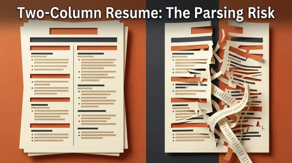
- Two-column layouts do not fail because they are “two columns”. They fail because of how the columns are built and how the ATS converts your file into plain text.
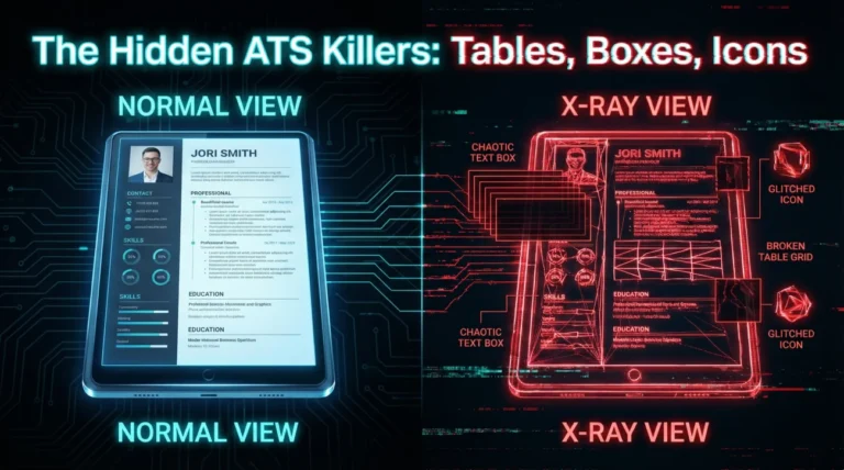
- Use a simple risk check: If your “columns” are text boxes, tables, icons, or Canva-style PDFs, assume the parser will scramble the reading order.
- If you love the two-column look, you can keep the same visual hierarchy using single-column alternatives that stay readable for both ATS and humans.
The uncomfortable truth about a “two-column resume”
I once worked with a candidate named Leona who swore her resume was “clean” because it looked clean. Left column: skills and tools. Right column: experience. Elegant, balanced, and easy on the eyes.
Then she applied through a portal, and the preview inside the application form did something brutal: It stacked her left column first, then her right column. Her “Skills” appeared before her name. Her job titles got separated from the bullets that proved she could do the work. It was not that she lacked experience. It was that the system could not keep her story in the right order.
That is what most people miss about two column resume ATS debates. The argument is not aesthetic. It is about extraction order, text containers, and whether your content survives conversion without getting rearranged.
Key Point: An ATS does not “see” your layout. It sees a stream of text pulled from boxes, rows, and columns in whatever order the file exposes.
Why columns break parsing, even when the resume looks perfect
When you upload a resume, most systems do some version of this: convert the file into text, try to detect headings, then map content into fields (job title, employer, dates, skills, education). The weakness is step one. Conversion is where the “reading order” gets decided.
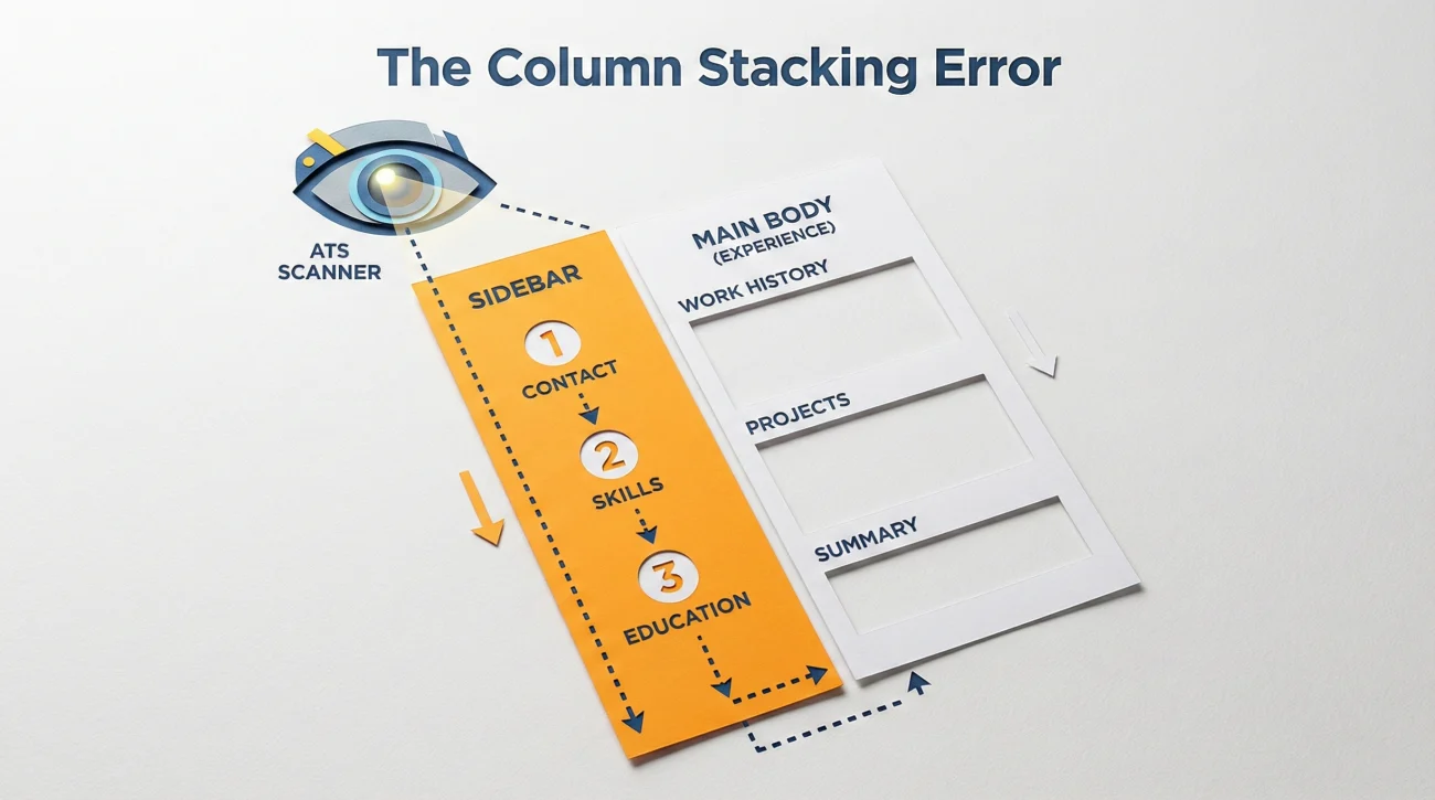
The three most common failure patterns
- 🧩 Column stacking: The ATS reads the entire left column top to bottom, then jumps to the right column. Your timeline turns into a puzzle.
- 🧱 Container confusion: If your columns are built with text boxes or tables, content can be extracted cell by cell. That is where job titles and bullets get divorced.
- 🫥 Missing data: Icons, graphics, and “pretty” sidebars sometimes convert into empty space. The ATS does not hate design. It just cannot reliably extract it.
So, can ATS read two column resume files at all?
Sometimes yes, sometimes no. The practical answer is: It depends on whether your columns are “native text flow” or “decorative containers”. In real hiring, you do not control which ATS version, which parsing rules, or which conversion tool the employer uses. That is why risk management matters more than theoretical capability.
| What you intended | What a parser might output |
|---|---|
| Header: Name, title, contact, then summary | Contact icons and sidebar text appear first, name appears later |
| Experience: Job title + company + dates + bullets together | Dates extracted in one block, bullets extracted elsewhere |
| Skills grouped neatly in a left sidebar | Skills list breaks into fragments or disappears |
⚠️ Warning: If your resume uses icons for phone, email, or location, always write the actual text next to them. Icons alone are a common “vanish” point in conversion.
Risk tiers: When a two-column resume is “mostly fine” vs “likely to break”
Most internet advice skips this part, but it is the only part that helps you decide fast. Think of your resume as a file engineering problem, not a style preference.
| Tier | How columns are built | What usually happens | Best move |
|---|---|---|---|
| Low risk | Native columns in Word or Google Docs, minimal graphics | Often parses acceptably, but still not guaranteed | Test it, then decide role by role |
| Medium risk | Tables used as layout, heavy alignment tricks, multiple text blocks | Job titles and bullets can separate, sections can reorder | Convert to single-column for applications |
| High risk | Canva templates, text boxes, icons as labels, InDesign-like PDFs | Content disappears or scrambles. The preview looks wrong | Use an ATS-safe version as default |
💡 Pro Tip: If you can click into your text like a normal document and the cursor flows naturally line by line, you are usually safer than if you are clicking into separate “boxes”.
A quick self-check that takes 30 seconds
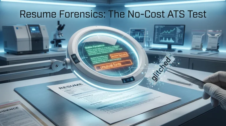
- Copy everything from your resume and paste into a plain text editor. If the order looks weird, the ATS order will likely be weird too.
- Upload it into a job application portal and look at the “parsed” preview. If headings shift or bullets detach, do not gamble.
- Ask yourself one honest question: Would I be okay losing one interview because my dates and titles got scrambled?
Safer alternatives that keep the “two-column feel” without breaking ATS
People choose two-column layouts because they want density and scanability. You can get both without literal columns.
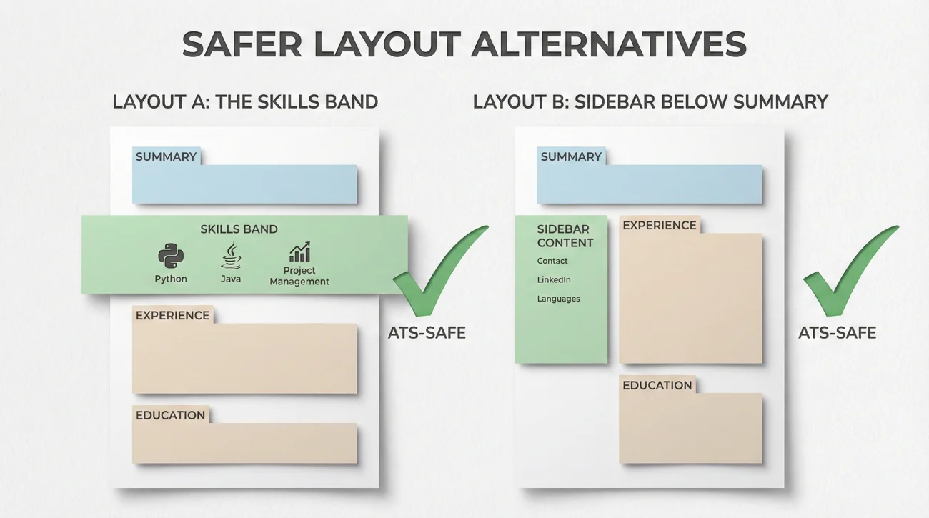
Option 1: Single-column with a compact “skills band”
This is my favorite for candidates who want a modern look but also want the parser to behave. Keep the experience section clean, then create a skills band using plain text separators.
TOOLS: BigQuery | Looker | Jira | Excel (advanced)
DOMAIN: B2B SaaS | Pricing | Retention
Option 2: Right-aligned micro-details inside the same line
Instead of a second column, keep micro-details short and aligned on the same line. Humans still scan fast, and ATS still reads in a single flow.
2023 to 2025 | Remote
– Built retention dashboard that reduced churn investigation time by 40%
– Partnered with Product to prioritize experiments based on cohort behavior
Option 3: “Sidebar content” moved below the summary
If your left column is mostly supporting context (tools, certifications, languages), move it under the summary. That preserves your hierarchy: humans see it early, ATS reads it cleanly.
❌ Note: If your “sidebar” contains critical keywords for the role, do not hide it in a fragile container. Put it where the parser cannot miss it.
These options are especially useful when your current layout is two column resume not ATS friendly because it relies on design templates instead of text flow.
If you insist on two columns, here is the damage-control strategy
I get it. Sometimes the two-column design is part of your brand, especially in creative roles or when your resume is also a portfolio artifact. I have friends in design who still use two columns because their hiring manager expects visual taste.
The two-version approach that avoids drama
Create two files and use them intentionally:
- ✅ ATS-safe version: Single-column, no tables, no text boxes, minimal icons. This is your default for portals.
- 🎨 Design version: Two-column, visually polished. This is for referral shares, direct emails, and interviews.
💡 Pro Tip: Name the files clearly so you do not accidentally upload the wrong one at 1 a.m. Example: FirstName_LastName_Resume_ATS.pdf and FirstName_LastName_Resume_Design.pdf.
Where people accidentally sabotage themselves
The most common mistake is uploading the design version into a portal that forces parsing. The second most common mistake is putting the most important keywords in the sidebar. If your right column carries your impact, you are betting your interview on the conversion tool.
“I did not think it mattered. Then the application preview turned my resume into two separate stories. My experience was there, but it was in the wrong order, so it looked like I could not hold a job.”
That is why I coach candidates to treat formatting like risk. You want your story to survive the machine stage so a human can judge you fairly.
Choosing the best layout based on how you apply
People ask for the best resume layout for ATS as if there is one universal answer. In practice, your best layout depends on the path your resume takes.
| How you apply | What the system does | Layout recommendation |
|---|---|---|
| Job portal with parsing | Converts file into fields, may reorder text | Single-column ATS-safe version |
| Referral email to recruiter | Recruiter sees the PDF directly | Either version, but keep text selectable |
| Creative role with portfolio review | Human-first review, design is evaluated | Design version plus ATS-safe backup |
| Agency or high-volume screening | Fast parsing and keyword search | ATS-safe version, no experiments |
If your goal is consistency across unknown systems, a single-column format is still the safest. Not because it is trendy. Because it reduces points of failure.
That is also why “two column resume applicant tracking system compatibility” is the wrong question. The right question is: What is my tolerance for a parser misunderstanding my career story?
Final
A two-column resume is not automatically doomed, but it is often an unnecessary gamble. If your layout is built with boxes, tables, icons, or heavy design elements, the machine stage can rearrange your story in ways you will never see until it is too late.
My rule is simple: If you are applying through portals, default to an ATS-safe layout. If you are sharing through humans, you can bring design back in, as long as the text remains selectable and the reading order stays logical.
When you approach two column resume ATS as a risk decision instead of a style argument, you stop chasing opinions and start protecting outcomes.
❓ FAQ
🧠 Is a two-column resume always rejected by ATS?
No. Some systems parse two columns fine, especially when the columns are built with native text flow. The problem is inconsistency across employers, plus the higher chance of scrambled order when text boxes, tables, or design templates are involved.
🧪 How can I tell if my two-column resume will break parsing?
Do a plain-text check and a portal preview check. If the pasted text order is weird, or if the application preview rearranges sections, treat that as a red flag and use an ATS-safe version.
📎 Should I upload PDF or Word if I use columns?
Either can work, but both can fail depending on how the columns were created. The safest move is not picking a file type, it is removing fragile containers and keeping content in a single, predictable flow.
🎨 I am in a creative field. Can I keep two columns?
Often yes, especially for human-first reviews. The smart compromise is to keep a second ATS-safe version for portals, and use the design version for referrals, emails, and interviews.
✅ What is the simplest fix if my resume is already two-column?
Move sidebar content into a skills band or a compact section under your summary, then keep experience in a single column. That preserves the same hierarchy while reducing parsing risk.
⚠️ Disclaimer: ResumeSolving provides resume, cover letter, and job search communication guidance for informational purposes only. It is not legal, medical, financial, or professional counseling advice. Hiring decisions vary by company, role, location, and individual circumstances, so we do not guarantee interviews, offers, or outcomes. Always use your own judgment, verify requirements directly with the employer, and follow local laws and workplace policies. When a situation is sensitive, we prioritize privacy-safe, recruiter-appropriate wording, and you never need to share personal details you are not comfortable disclosing.