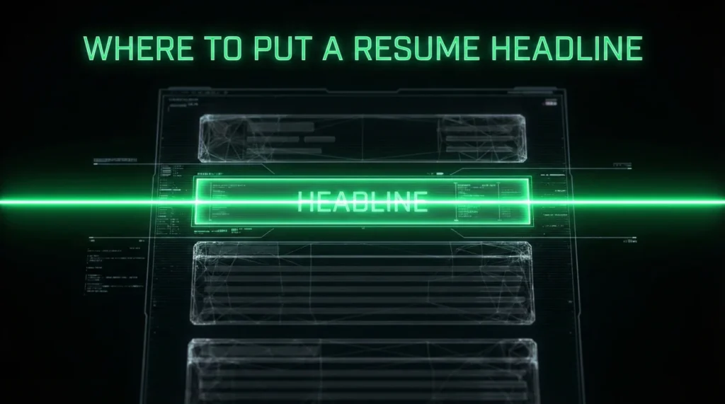
- If you want the safest default: Put your headline in the document body, directly under your contact line, above your summary.
- If your template uses a Word header, icons, or two columns: Your headline can vanish in ATS parsing even when it looks perfect on screen.
- Use one clear placement rule, then adjust only when you have a real reason (title + headline stack, no summary, or career change clarity).
Where to Put a Resume Headline: Placement Rules That Don’t Break ATS
I want to start with something I’ve watched happen more times than I can count: Someone finally writes a strong headline, then hides it in the one place the system is most likely to ignore.
A former candidate of mine, Heidi, had a clean one line pitch. It was specific, it matched the job title, and it had proof. She sent me a PDF to review and I could not find the headline at all. Turns out it was sitting inside a fancy header block in her template. On the page, it looked premium. In the extracted text, it barely existed.
This is why where to put resume headline is not a design question. It is a readability and parsing question. Recruiters scan fast, and ATS tools read in their own weird order. Placement is how you make sure your best line actually gets seen.
💡 Pro Tip: If you remember only one rule from this article, remember this: Put your headline in the document body, not in a Word header or footer.
The default placement rule that stays safe in most ATS
Let’s make the default super clear. If you are using a simple one column resume, and you want the most reliable placement, do this:
Name → Contact line → Headline → Summary (optional) → Experience
This is the most common recommendation across resume resources, and it works because it matches how humans scan the top of the page. It also tends to survive parsing when your content is not trapped in a header container. :contentReference[oaicite:4]{index=4}
| Element | Placement decision |
|---|---|
| Name | Always first, largest text. Keep it plain. |
| Contact line | Second. One line if possible. No icons required. |
| Headline | Third. One line, role plus proof. |
| Summary | Fourth. Optional. 2 to 4 lines is enough when you use a headline. |
Most weak articles stop here. The problem is that “top of the resume” is not a single place. A template can put your contact inside a Word header, a text box, or a two column grid. On screen, everything still looks “top”. But ATS extraction can treat those elements like separate layers.
What breaks ATS most often is not the headline, it is the container
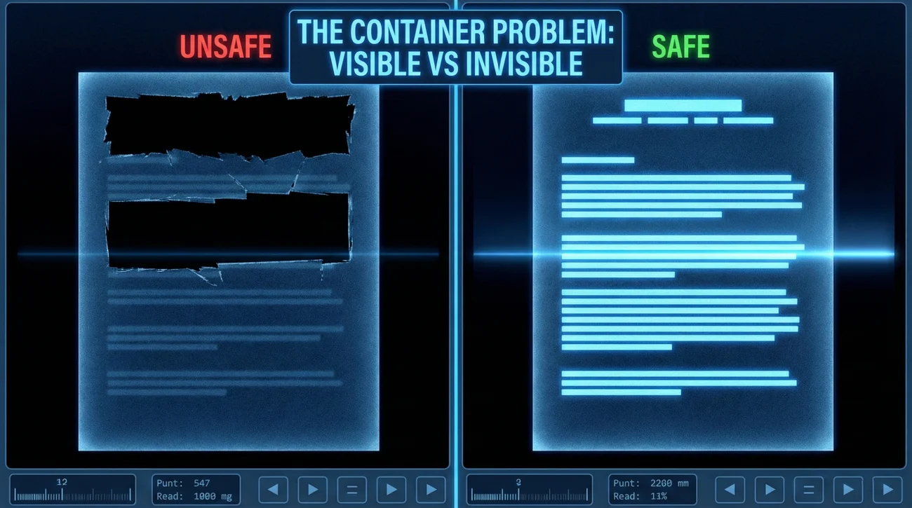
When people ask me about resume headline placement, they usually expect a one line answer. The real answer is: Placement is only safe if the container is safe.
Here are the three containers that cause the most trouble:
1) Word header and footer areas
Many templates put your contact details in the actual header area of the document. It is visually clean. It is also the exact place some ATS parsers ignore or strip, because it is not part of the main body text flow.
If your headline lives inside that header block, it can disappear. The recruiter might still see it in a PDF, but the system might not capture it in the candidate profile.
2) Text boxes and shapes
A headline inside a text box is a frequent culprit. Some ATS tools read it out of order, some drop it, and some merge it into the wrong field. It is one of those design choices that feels harmless until you test a plain text export.
3) Two column layouts with tight top sections
Two column resumes can work, but the top area is where parsing gets messy. If your headline is in the left column and your contact is in the right column, the extracted text can come out in a strange sequence. This is how you end up with a headline that reads like a fragment because the system stitched it to the wrong line.
Key Point: If you want your headline to be reliably captured, keep it in the main text body, in a single flow, without shapes, text boxes, or decorative header containers.
One colleague of mine, Marcus, runs recruiting ops for a mid size tech company. He told me he has seen “missing headline” issues most often on beautifully designed PDFs where the candidate used a template header block. The resume looks premium, the ATS profile looks empty. That mismatch costs interviews.
Headline vs title vs summary: The placement choices that look intentional
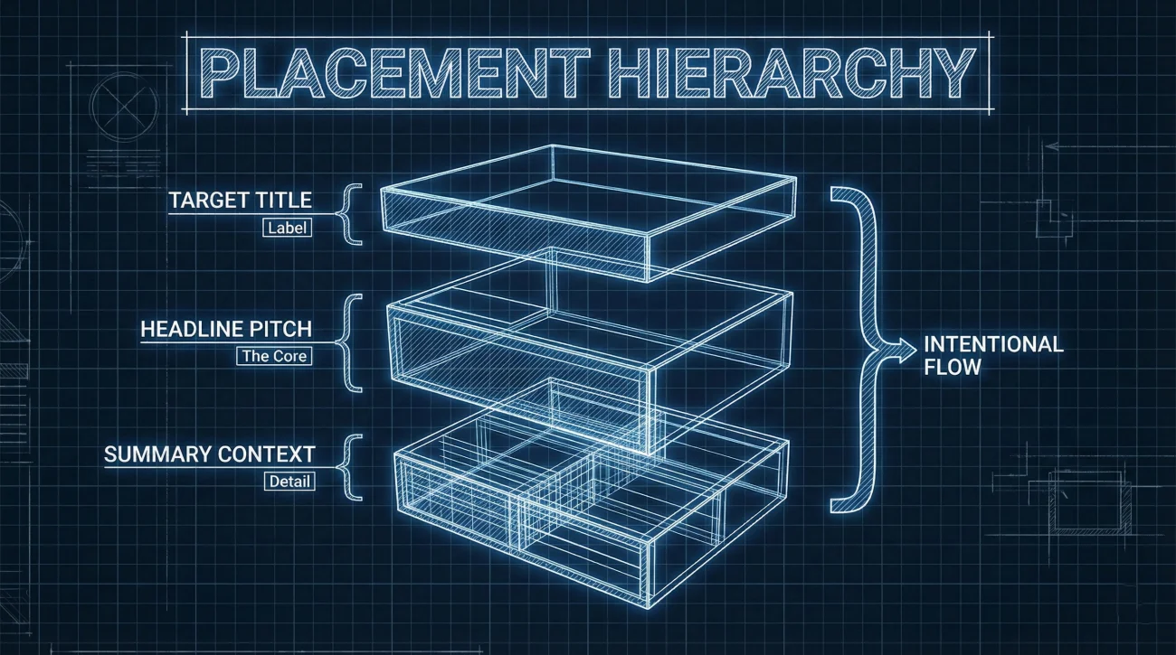
The other gap in most articles is they treat “headline” as a single thing. In reality, candidates use three different top of page elements and then wonder why it looks crowded:
- Title: A plain target role label. Example: “Customer Success Manager”.
- Headline: A one line positioning statement with proof. Example: “Customer Success Manager | 5+ years reducing churn in B2B SaaS”.
- Summary: A short paragraph that adds context and scope.
When you should use a title line
Use a title line when your name is large and your contact line is busy. The title gives a fast anchor. It also helps if your last job title does not match the role you are targeting.
Placement rule when you use a title:
Name → Title → Contact line → Headline (optional) → Summary
Yes, that means your headline can sit under contact instead of under title. That is not “wrong”. It is often cleaner, because it separates the label (title) from the pitch (headline).
When you can skip the summary and let the headline carry the opening
If you are early career, or your experience is straightforward, a headline can replace a summary. In that case, you want your resume headline location to be directly above Experience, because it becomes the bridge into your work history.
Placement rule without a summary:
Name → Contact line → Headline → Experience
Career change: The headline should not outrun the evidence
Career change candidates often write the strongest headline and the weakest supporting content. That is when the headline starts to sound like a claim.
If you are switching fields, keep the headline close to the section that proves it, usually a short summary or a projects section. The headline is still near the top, but it should not feel like a billboard floating above unrelated experience.
⚠️ Warning: If your headline says you are a “Data Analyst” but the first proof of data work appears halfway down page one, the reader experiences friction. Placement cannot fix that. The best you can do is bring proof closer, or soften the headline.
Six placement examples you can copy
Below are six header layouts. They are written as plain text blocks so you can paste them into a normal document without relying on shapes or design elements. Each one answers the question: where does resume headline go in this specific scenario.
Example 1: The safest default (headline under contact)
Austin, TX | [email protected] | 555-123-4567 | linkedin.com/in/jordanlee
Customer Success Manager | 6+ years reducing churn in B2B SaaS
Use this when you want maximum ATS safety and the resume is one column.
Example 2: You want a title label plus a headline pitch
Product Marketing Manager
Seattle, WA | [email protected] | 555-222-1919 | linkedin.com/in/priyaraman
PMM focused on PLG onboarding | Led messaging refresh that lifted activation 18%
This is clean because the title is a label, and the headline is proof. They do not fight each other.
Example 3: No summary, headline bridges straight into experience
Chicago, IL | [email protected] | 555-777-3030
IT Support Specialist | 4 years in ticket triage, device setup, and SLA improvements
This works best when your experience section immediately supports the claim.
Example 4: Career change headline that stays honest
Denver, CO | [email protected] | linkedin.com/in/sofian
Transitioning into UX Research | Built 6-study portfolio using mixed-methods interviews and synthesis
Notice the wording. It signals direction and proof without pretending the job title is already earned.
Example 5: Executive style with a tighter, quieter headline
San Francisco, CA | [email protected] | 555-909-8181
Operations Leader | Scaled multi-site teams, cut costs, and improved delivery reliability
Executives do not need a long headline. The placement is the same, but the tone is different.
Example 6: Entry level headline that does not read like fluff
Boston, MA | [email protected] | github.com/mayap
Junior Data Analyst | SQL projects, dashboard builds, and data cleanup for student org reporting
Entry level headlines should be concrete. Use projects as proof, not adjectives.
Mistakes that make your headline “disappear” or look untrustworthy
Here is the short list I keep in mind when reviewing resumes fast. It is not theory. These are patterns that have shown up in real ATS exports and real recruiter reactions.
- Putting the headline inside a Word header: Looks clean, parses poorly in many setups.
- Using icons before contact details: Icons can break text extraction or produce junk characters.
- Two columns at the very top: Your headline can be read out of order, especially if contact info sits in a separate column.
- Headline buried under a long summary: If the reader has to work to find it, it is not doing its job.
- Headline repeated as a section header: Example: you write a “Professional Summary” header, then paste the same headline again. It reads like filler.
- Headline too long: If it wraps into three lines, it stops being a headline and starts being a mini bio.
❌ Note: If your headline only makes sense after someone reads your whole resume, it is not a headline. It is a hidden summary, and placement will not rescue it.
“I loved the resume design, but the system summary looked blank. The candidate thought they had a strong top line. We literally could not see it in the profile.”
That quote is from a recruiter friend who screens high volume roles. The headline was there, but it lived in a decorative block. The candidate never knew it was missing on the other side.
A quick placement checklist before you submit
Do this once and you will stop worrying about placement forever.
- Export your resume to PDF, then copy all text and paste into a plain text editor.
- Confirm your headline appears near the top in the correct order.
- Confirm it is in the main text body, not trapped in a header, footer, or text box.
- Keep it to one line when possible.
- Make sure the first proof for the headline appears on page one.
If you do nothing else, the plain text paste test will catch most placement mistakes instantly.
Final
I think the reason people obsess over headline placement is they want control over first impressions. That instinct is correct. But the easiest way to control it is not to over design it. It is to place it in the simplest, most readable path the reader and the software will follow.
When Heidi moved her headline out of the template header and into the document body, nothing about her experience changed. The only thing that changed was visibility. The headline stopped being a decorative element and became what it was always supposed to be: the first clear signal of fit.
If you keep one rule, keep this one: The safest answer to where to put resume headline is directly under your contact line, in the main document body, above your summary or experience. Simple, readable, hard to break.
❓ FAQ
✅ Should the headline go above or below the summary?
In most cases, put it above the summary. The headline is the hook. The summary is the context. If you put the summary first, the headline loses its purpose.
🧩 Can I put my headline on the same line as my name?
You can, but it often looks cramped and can be harder to parse cleanly. If you do it, keep the text plain and avoid special separators that might break extraction.
📌 Is it okay to put the headline under the section header “Professional Summary”?
It is usually weaker. The headline works best as a standalone line before any section labels. Otherwise it reads like part of the summary block.
🧠 What if I have both a resume title and a headline?
Put the title as a label right under your name, then place the headline after the contact line. This keeps the label and the pitch from competing.
📄 Does ATS always read the top of the page first?
Not always. Many systems read in a structured way depending on layout. That is why keeping your top section in one clean text flow matters more than visual “top”.
⚠️ Disclaimer: ResumeSolving provides resume, cover letter, job search communication, and career transition guidance for informational purposes only. Hiring practices vary by employer, role, location, industry, and individual circumstances. We do not guarantee interviews, job offers, ATS results, or other outcomes. Verify employer requirements directly and follow applicable laws and workplace policies. For sensitive situations, use only information you are comfortable disclosing and keep all statements accurate.